Articulate’s suite of products rate high in the rapid authoring segment. We have used them for several projects, and have found them very effective for development and simple to use. They give standards-conformant output, and save development time and cost.
The latest version, Articulate ’09, has some interesting new features like Single-slide Preview, FLV Support, Easy Audio Editor, and Articulate Branding Removed. You can read more about some of its popular features here.
With all its advantages, Articulate does have a few bugs – although the company did recently release a patch for Presenter ’09 that resolves a large number of bugs [view the whole list of resolved issues here].
Based on our recent experiences with Articulate ’09, we’ve compiled a list of common problems we came across, together with tips on how to work around them:
| 1. | Missing lines in graphs – The PPT graphs sometimes don’t convert properly to Flash, leading to missing lines. If your project uses relatively less graphs, then converting the graphs to images and importing them into Articulate can be an effective solution. However, if your project is graph-heavy, then images may not be a good idea. In this case, try setting the player template display at an optimal level and avoid scaling (this worked most of the times for us). | ||||||||||
| 2. | Font styles – At times, ‘bold’ or ‘italics’ text in the PPT doesn’t appear the same way after publishing in Articulate. Another thing that happens quite often is that extra spaces are added before/after the text. You could avoid this by using a ‘Bold’ or ‘Italics’ style font from the Font families. For e.g.: Arial Bold, Arial Italics, etc. | ||||||||||
| 3. | Adding a user name in a certificate – The default course completion certificate in Articulate doesn’t include a user name. To get around this, we created a new custom certificate wherein the HTML file containing the certificate SWF file extracts the user name from the LMS using a SCORM API. | ||||||||||
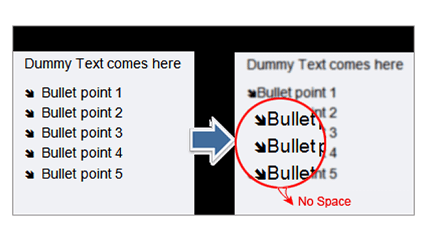
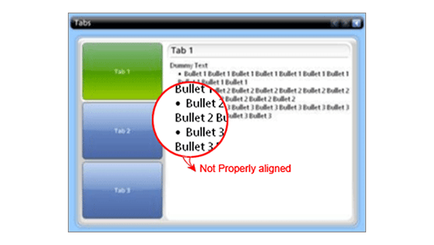
| 4. | Inconsistent indents for bulleted text – For clarity, here are some mockups that can help relate with this situation better. | ||||||||||

Solution: You can avoid inconsistent indents by adding the bulleted text in a separate text box in the PPT.
Engage Output 
|
Hope these tips will be of help.
If you have some other ways to resolve similar issues, do share them with us. Or if you have faced some other issues and not found a solution, please do share those as well. Maybe we could find a workaround for them.


