Most companies nowadays emphasise that the design of their eLearning must factor in accessibility. They realise that a critical part of building a diverse workforce and more inclusive culture is ensuring that everyone has access to the same calibre of training. Specifically, all learners should be able to take up eLearning without hassles or losing out in any way on the learning experience, even if some of them use assistive technology.
In the current scenario, which demands that the learning content should also be accessible on a range of devices, many companies choose to use Rapid Authoring Tools for the convenience of ready-made accessibility and multi-device support.
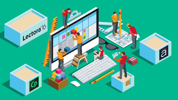
However, it then becomes imperative for you as an organisation to know right at the beginning of a project what exactly you can achieve if you decide to go ahead with using authoring tools like Captivate, Articulate Storyline, or Lectora. While most of these support accessibility in some way or another, you need to know exactly what is supported so you can pick the tool that will best support your needs.
For example, if you have a diagram in a course, Captivate or Articulate will ensure that the ‘Alt text’ is passed on to a screenreader. But, as an author, you have to provide that Alt text for the diagram. So let’s look at creating accessibility in two stages.
1. What do authors need to consider while developing the output?
2. What does each tool have to offer when you select the accessibility feature while publishing the output?
Irrespective of your choice of tool, you need to consider the following things while storyboarding:
- If you use sounds, voiceover, diagrams, images, animations, simulations, and video elements (and yes, you can!), ensure that you provide the text equivalent (‘Alt text’) or closed captioning script for these. The simple rule: it if isn’t textual, provide the textual fall back.
- Don’t plan on having progressively loaded information on a screen. Anything not “initially visible” when the page loads will not be read by a screen reader. For example, don’t think of having bulleted points appear one after another. Have them all come up at once.
- Consider font sizing for those who may need to see text at a larger size. But this is kind of a routine feature by now in most modern browsers, so you’re probably covered.
- When you’re choosing colours for texts, panels, or any visual elements, pick proper contrasts. Avoid the following colour combinations, which are especially hard on colour blind people: Green and Red; Green and Brown; Blue and Purple; Green and Blue; Light Green and Yellow; Blue and Grey; Green and Grey; Green and Black.
- Don’t use colour coding as the only means of conveying information, indicating an action, prompting a response, or distinguishing a visual element. For example, don’t just have best practices in a pastel coloured box; actually have a caption saying ‘Best Practice’ above the content.
- Ensure that explanations of links make sense when you just read them out. For example, avoid “click here”. That’s terrible in general and worse for accessibility. “Click here for a magnified view of the workflow” is much better.
- Summarise graphs and charts where possible. For example, ‘Positive correlation demonstrated between number of errors made and number of pages produced’.
- Provide alternate content for case scripts, applets, and plug-ins that are inaccessible or unsupported. We’ve all been annoyed by poorly designed web pages at some point!
- If you include drag-and-drop or hotspot interactions, provide an alternate, keyboard-controlled interaction mechanism.
- When you use bitmap images to identify controls, status indicators, or other programmatic elements, assign a consistent meaning to those images throughout your course.
Here are some things to keep in mind when you’re developing the course in a tool:
- When you are using multimedia, synchronise the text captions with audio and video. So for an animation, don’t just put up the entire transcript at one go. Instead, the narration must progress in the transcript along with the display of elements on the screen.
- Keep testing your design for accessibility — check your storyboard, your visual design mock-ups, the interactivities, etc. You don’t want to finish making a course to discover at the very end that it’s not accessible!
- Make sure that all Alt text and audio descriptions are selectable with a mouse. Simply put, you should be able to left click and swipe your mouse across the text, highlighting the text in the process as in a text editor.
In regards to what each tool can cover, we have broadly summarised some points for you to compare are and determine which tool would server your needs.

Note: None of these tools will handle changing background colour, font colour or font size themselves. If you have a requirement to do so, going with the custom development approach would be best.
SOURCE
Articulate Storyline 2
Captivate 9
- Adobe Captivate Help / Creating accessible projects in Adobe Captivate
- Accessibility / Adobe Captivate 9 – Voluntary Product Accessibility Template
- Accessibility / By product / Adobe Captivate
Lectora 16
We do hope the above details help.
Do share your thoughts and experience while working with accessibility settings and any feature you think would be most useful to have in eLearning courses from the accessibility perspective.