“‘What is the use of a book’, thought Alice, ‘without pictures or conversations?'”
Most of us agree that the use of images and graphics in e-learning help the learners make visual associations. However the images or graphics need to be relevant to the content being presented. They need to support the text and be used, not for diversion, but a clear instructional purpose.
Even a relevant image or graphic can hinder learning if the page isn’t designed properly. ‘Some Best Practices’ can contribute to developing a better learning experience.
- Don’t Distract
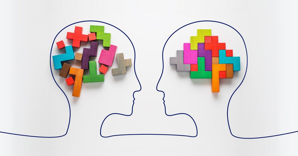
We usually have a tendency to use visual eye candy that conveys little or no new information. Graphics are unnecessary if the text itself prompts the formation of mental images. If they are not relevant to the text, graphics become distracting. For graphics to aid the text, the text must be understandable independently. Graphics should then provide a clear representation of the content to be remembered, without extraneous information.This principle is supported by Paivio’s Dual Coding Theory. The dual coding theory, a theory of cognition, was first advanced by Allan Paivio of the University of Western Ontario. The theory postulates that the human cognition consists of two subsystems that process knowledge simultaneously, one processing the verbal objects and one dealing with visual objects. The two systems have different functions; the verbal subsystem processes and stores linguistic information whereas the visual subsystem processes and stores images and pictorial information. While the two subsystems can be activated independently, the interrelations and connections of the two systems allow the dual coding of information. - Proximity
Just like proximity creates a bond between people; it can also create a bond between the various elements on a single page. How close together or far apart elements are placed suggests a relationship (or lack of) between otherwise distinct parts. It’s something to keep in mind while designing the page layouts and interaction. - Alignment
How you align text and graphics on a page and in relation to each other can make your layout easier or more difficult to read, foster familiarity, or even provide an element of excitement. - Consistency
Repeating design elements and consistent use of type and graphics styles within a course shows a learner where to go and helps them navigate the course.- Ensure that page numbers appear in the same location from page to page.
- Ensure that major and minor headlines are consistent in size, style, and placement.
- Use a consistent graphic or illustration style throughout the course.
- White Space
Designs that try to cram too much text and graphics onto the page are uncomfortable and may be impossible to read. White space gives your design breathing room.- Keep enough space between paragraphs of text.
- Make sure that text does not run into frames or graphics.
- Keep a generous margin.
This is what comes to my mind, mostly common sense media design. Have suggestions? Add a comment.


