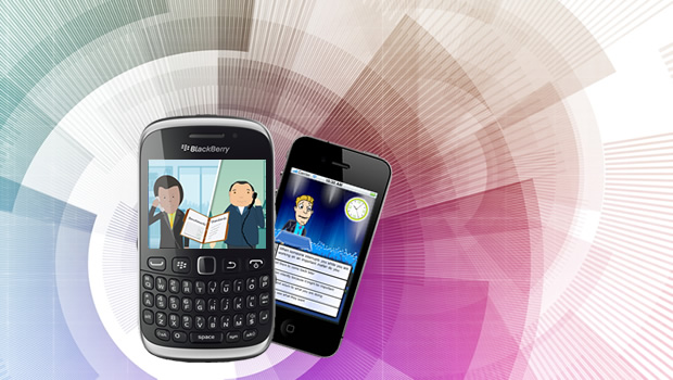
We’ve recently been delivering simple content just-in-time for access through the websites that are designed to run on mobile devices.
It was easier said than done, here are some lessons we picked up along the way.
1. Focus On A Few – We all want our sites to work perfectly across the whole range of browsers and the multitude of devices that may access it and seek information. While idealistic, discard this thought right away, its just not practical for designer and developers to create a universally portable site like that. One goal of the design would be identifying target devices that potential users will have. If the users predominantly use iPhones, then focus on developing for that platform. If you have loads of users in Continental Europe and Asia, you’ll find that Symbian is the preferred platform. A vast number of phones out there today use WebKit to render content, but that doesn’t really guarantee the content will render identically across devices.
2. Use Emulators – It’s not feasible to have each and every device available on a particular platform to test on. It’s more sensible to use emulators for the target devices during the initial stages of design and development. Almost all major platforms have emulators. Here is a post about some tools that are used for mobile learning development from one of our stellar developers. You can also quickly switch the user agent in your browser to see what the site might look like. Safari builds this in, while Firefox can support it using a plug-in.
3. Use Device Specific Style Sheets – This is perhaps the most elegant solution to rendering content across a variety of browsers/platforms. Add a mobile device specific style-sheet that will render content based on the capabilities of the device accessing, the web server can then determine which content to serve up.
A couple of interesting places to find more information about this:
• http://css-tricks.com/resolution-specific-stylesheets/
When I was considering the design of such sites, I found that usability pundits advocate making mobile-only sites because mobile users are in a hurry; they’re on the go and want to perform one specific task and then finish. Isn’t that true of every site? They often give the example of a restaurant – users of a mobile site would just want to know the location, hours of operation and perhaps the menu/prices. Come to think of it, if I used a desktop-based web-browser I’d be looking for similar information. I firmly believe all browsing activity is driven by an information/task-based need, regardless of device and location.
Take a quick glance through this simple but interesting presentation about the media design of such sites.


