Yes, I’ve not been blogging as regularly as I might have liked to. I’ve been busy with projects – bread and butter.
We’ve always focused on instructional design being essential to the design of courseware. That’s certainly true, it’s the first step to make a learning solution instructionally sound. The next in line is to make it interesting, engaging, interactive. Too many solutions fail at that crucial stage. I’ve seen too many hours of what is commonly termed ‘shovelware’ that result from this failure.
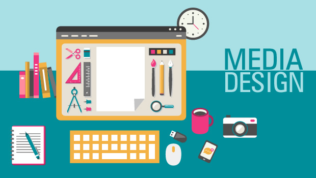
I see just three reasons why eLearning should focus some more on the media design.
- Media is Experience – It’s the experience that matters and media is what you’re using to build it. When designers think of presentations in space and time, interactions, graphics, they don’t think of those as part of the media but as a elements in a learning solution. That view holds, but it’s also important to understand media and the ability to deliver a ‘sticky’ experience. That depends to a very large extent how you build engagement and interaction into your media choice. Focus on media if you want to create sticky learning, but do not ignore fundamental learning design.
- Media is Malleable – Media is capable of all sort of contortions and a creator/developer can shape it exactly as they like. If you’re not melding the media around the design of the experience, you’re missing a crucial element. It’s important to differentiate between the design of media and visual appeal. Just because the media is visually appealing doesn’t mean it’s effective design. This is perhaps the most common misconception I see when reviewing course output.Seriously, stop thinking of beautiful media, start thinking of effective media. Beauty without purpose has no place in eLearning. Media for purely aesthetic reasons would be termed art. eLearning on the other hand is very specifically ‘designed’ to impart knowledge or skills. Focus on media to deliver the right message the right way.
- Media is Digital – Digital media is relatively new and quite different from the forms of media we’ve seen in history. As a result, designers are still understanding digital media, it’s metaphors and forms. Attempting to use book-like or paper-driven metaphors do not work well in the digital space. Perhaps the biggest difference and advantage digital media offers over traditional media forms is in its ability to support interaction. One might debate that the design of interaction is very different from media design. I’d disagree, if media is digital, then interaction is a huge part of it. So I look at interaction design as a subset of digital media design. It’s almost impossible to imagine digital media without interaction. Interaction holds great value when designing learning experience, as it allows users to engage with the content at a level that was not possible just a few years ago.
Having said this, it’s also very important to know that media evolves. As learning designers, we need to consider the constraints and opportunities that emerge from this evolution. If we don’t, we’ll end up with disjoint offerings. I’d hate it if someone labeled something I designed ‘crap-ware’ or ‘shovel-ware’, it’d seem a failure.


