We discovered ‘The Ten Commandments of eLearning” as elucidated by Cath Ellis and Clive Shepherd. We’ve decided to follow in the same vein and list our commandments. First off, we thought ten is too many to remember, so we cut it down to five. There are some similarities to Cath and Clive’s commandments but that is to be expected given the nature of this post.
| 1. | Pedagogy First, Technology Second – Cath put it first on her list, we do as well. Use technology, leverage it, but always remember it’s a means to an end. The desired end is learning and resultant performance and not the use of cool technology. However, knowing what technology to leverage for effective learning is essential too. Remember, technology can’t replace learning, only augment and support it. |
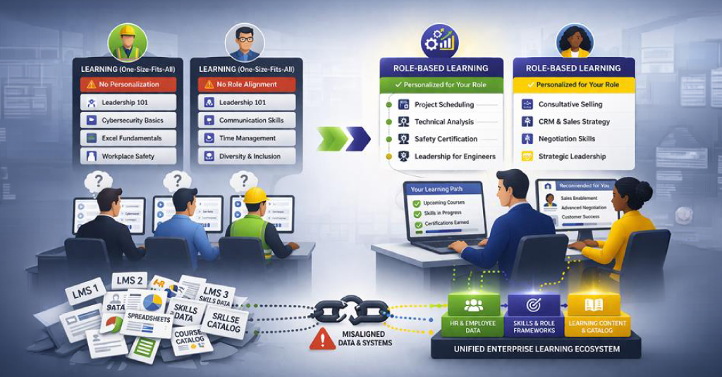
| 2. | Always tie to performance outcomes – A lot of eLearning is irrelevant because the designers didn’t really bother to ask what problems their learners were trying to solve or what they were trying to do. Just shoveling content at your learners in the hope that they’ll pick up what they need isn’t a worthwhile strategy. Learning content must be targeted correctly for it to work, and the only way to accomplish that is by knowing about your learners and their goals. It’s also important to know that sometimes personal learning goals and corporate performance related learning goals are different for each individual. If you target the goal at the confluence of these streams, there is better chance that what you set out to teach is learnt, retained longer and improves performance and problem-solving. |
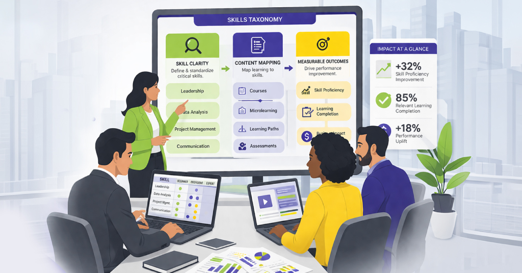
| 3. | Use Small and Smaller Learning Units – It’s these that allow for flexibility when creating personalized learning paths. Yes, the smaller you can make it the better. It’s the granularity that’ll let you design a custom learning experience for your learners. Think of it as learning Lego; you can use those small blocks of content to create different experiences based on learner need. The granularity also allows for just the right amount of content to be delivered, not more, not less. |
| 4. | Simplicity in Presentation and Content Structure – Simplicity is never easy, great care needs to be taken to simplify presentation and the structure of the content for learning to be effective. As Clive mentions in his commandment “Media should be chosen for their ability to aid understanding and memory, not because they impress.” It’s easy to fall into the trap of using sophisticated media without any obvious learning advantage. This sort of media bloats projects; costs more time and money, when something cheaper and simpler could have worked fine. |
| 5. | Context, Context, Context – Make sure context is maintained, in presentation, during practice and assessment. Learners taking training at work need it in a specific context, the instructional designer must maintain it by providing content that’s relevant to their workplace performance. Context can be enhanced by using scenarios, stories, demonstrations, examples, and case studies that tie in to the outcomes for that training. Some learning outcomes, especially in the corporate world can be viewed in a singular context and don’t need much else. However, there are behavioral or ‘softer’ outcomes that can’t be viewed in a single context; in such cases using varied contexts provides much value. |


