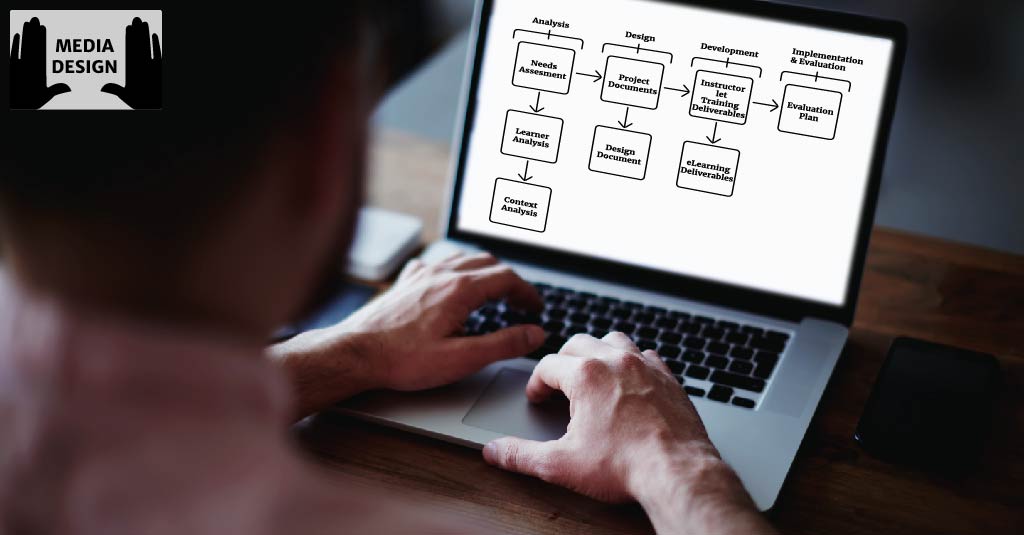
Over the last few weeks, I have been learning about the fundamental concepts and basic principles of designing electronic instructional media. These concepts are essential knowledge which constitutes a firm foundation, before one can be effective in an Instructional Designer’s role that involves media design.
Media design needs to be consistent and aesthetically pleasing, to orient the learners and gain their attention. However, quite often we go into over-drive and end up creating the instructional equivalent of ‘Eye-Candy’; definitely looks good but quite unfortunately — lacks substance.
As a learner, I need to understand the information that is presented; or else that information is of no use to me. The content that I see in front of my eyes needs to be converted from data into knowledge. Media design needs to focus on this critical transformation of information.
This post focuses on some basic design principles — specifically pertaining to the presentation of information, detailing what it takes to design a better learning experience.
- Organize the information on the page clearly and in a logical flow —
The purpose of instructional design is not to just present information, but to assist the learner in understanding the information presented. It is in this context that we can emulate the ‘chunking’ strategy used in printed text.
Printed text has an advantage over electronic text because the information is presented in a linear way and can be broken into easily recognizable “chunks”. The students can control the pace at which they learn these chunks.
In a textbook, chapters, pages, sections, headings, even paragraphs all “chunk” information in ways to help students comprehend and learn. There’s also the advantage of a physical break, since pages have to be turned. - Place adequate amount of information on the screen —
The first question that would come to anyone’s mind — What is an “adequate” amount of information?
An “adequate” amount of information could be one piece of content of a particular type, and associated pieces – e.g. a concept and its features.
Studies indicate that scrolling should be minimized. As a learner, I’m willing to scroll for a known purpose, such as coming to the end of a clearly defined section. However, I fail to comprehend the content if I’m confronted with a single screen of endlessly scrolling data, even if it is broken into headings.
Without “chunking” of information, the learners become overloaded with information and comprehension drops. - Use shorter lines of text —
Reading information from a computer screen can be as much as 30% slower than from a printed page. That’s why you should ideally break text segments into smaller parts when you intend to display text on-screen. Use less text than in print counterparts. A “chunked” layout delays fatigue and increases comprehension.
Another important factor that comes into play is “Brevity”. The writing style that you use needs to clear and concise. - Place the important information at the top —
Follow the journalism model of the “inverted pyramid”, by placing important information at the top of the page. To do this, it may sometimes be necessary to put the leader or connector at the end of the previous page. - Appropriately use white space to increase the page’s visual appeal —
Use white space to divide the “chunked” portions of the screen so that they are more easily read.
This is what comes to my mind. Add a comment if you have suggestions


