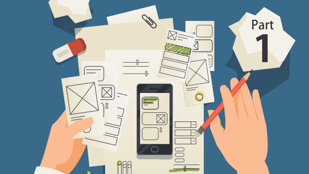
As we move more and more into the mobile space, we’ve found that there are several things very different from conventional courseware. One of the things that come to my mind right away is that in mobile, we are doing away with storyboards. Content is viewed differently, it’s data that has to be managed and rendered within the limitations placed by a variety of mobile devices. Storyboards were (are) ideal for serving as references for development of multimedia content. However as we started development on mobile learning applications, the game changed drastically. Storyboards were sorely inadequate to describe application features and states. And while design documents did well at containing technical details, they couldn’t give a feel for the user experience.
As learning designers being able to model the learning experience is very important, and creating a prototype is ideal to test out basic design ideas. This was easy when we made eLearning, the limited range of interactions and content presentation allowed for prototypes to be modeled quite easily. Mobile applications include myriad ways to present features, offer a variety of interaction types and combinations of those, making it very different.
What we needed was ‘something’ that let us model the features and functions of a mobile application. A prototype that could be created quickly and would let us discover various application states and problems that may result because of the way we design the application. Some considerations before jumping into ‘rapid prototyping’ an application:
- What part of your application really needs prototyping? – We tend to use prototyping when we want to model new features or functionality, are trying out a new design approach, or new technology. Basically, prototype when you feel the user experience is going to differ or depart significantly from those that your applications typically offer.
- How much to prototype? – We use the pareto principle when considering ‘how much’ to prototype. We ensure to prototype the 20% features/functions that will be used 80% of the time. This does not mean that ignore the remaining 80%, but the focus is well defined.
- Iterate repeatedly but finitely – it’s almost impossible to get a prototype with an acceptable user experience in the first step. At the outset, we like to decide the number of iterations we’ll put the prototype through. More importantly we stop at the number we’ve decided. You can continue iterating prototype improvements till the world ends, but the process wouldn’t. Put a number to it and stop there. We’ve found three iterations is plenty, and it’s the most customers will stand too.
- Determine the fidelity of your prototype – How closely the prototype models the final solution is the ‘fidelity’ of the prototype. The fidelity required for a mobile application prototype would vary depending on the features/functions and user experience sought.
In the next post in this series, I’ll be discussing levels of fidelity and determining which level works for your mobile application design project.


