Videos have always been effective where high-fidelity content is required. And with most platforms now failing to support Flash, videos have also become a technical means of including media-rich, vector-based, closely audio-synched animations (or for that matter any other type of animation) into multi-device eLearning. So before going any further, let’s establish the two ways in which the term “video” is used in this post: (1) to refer to real-life shot or “live action” films, and (2) to refer to animation output published in a video format (e.g. mp4, ogv).
Now when it comes to responsive design, we know that text can reflow. We know that images can be scaled, cropped, or if in a supporting role only, dropped. We know that layouts can be adjusted within a fluid grid. We know that content can be layered to suit device size.
But what about videos? Like images, they too need to be treated as a whole. They can’t reflow or be broken into layers. And in most cases, they contain core content and cannot be dropped.
So, let’s take a look at some key considerations when it comes to including videos in responsive eLearning.
Technical Approach to Scaling
When scaling videos for display on screens of different size and resolution, you can opt for either a “fit-to-screen” approach or a “fill screen” approach, depending on your requirement. As we will keep referring to these terms throughout the post, let’s first clarify what they mean.
Note that we have assumed that videos will be created in one of these aspect ratios: 4:3 or 16:9. Similarly, display screens could also be in either of these two ratios.
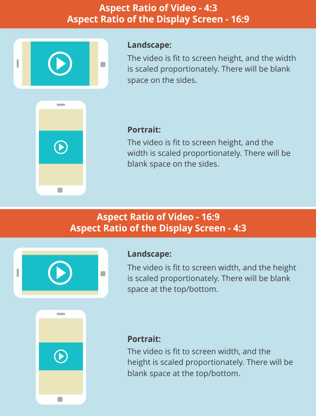
Fit-to-Screen Approach
In a fit-to-screen approach, a video is proportionately scaled to fit either screen width or height. The complete video is made to fit into the screen – without cropping any of it. Regardless of the size and orientation (landscape/portrait) of the device, the aspect ratio of the video remains constant. Here’s how this would work.

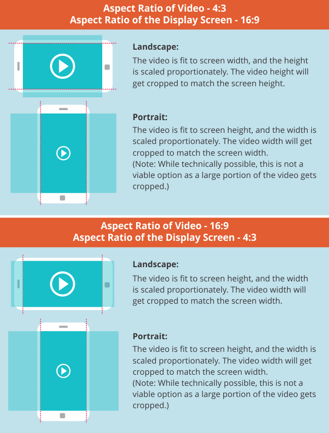
Fill Screen Approach
In a fill screen approach, video is proportionately scaled to fill the entire screen of a device (in landscape mode). If the aspect ratios of the video and the device are not the same, the scaled video needs to be matched either on width or on height. Any “overflowing” part of the video is cropped – this could be the height or the width based on which parameter you chose to match when scaling the video. Here’s how this would work.

Content Display
At the design stage itself, when chunking and structuring content, think about how much content is being presented in each frame – and what will be the clarity and readability of that content on a smartphone in portrait mode (i.e. the smallest display).
Presenting or building up to a smaller number of content elements in each key frame will avoid a squished, crowded, and difficult to comprehend screen on smaller devices. You also need to identify the instances where details of a visual are key to the information being communicated. In such cases, you may need to think of structures and treatments where these details can still be seen clearly even after the video is scaled down.
For example, we have an animation where we need to zoom into a checklist in someone’s hand. The checklist has 10 items, each containing a sentence or two of text and an accompanying graphic. On a laptop, the readability of those 10 items is fine; however, when the video scales down to fit onto a smartphone, the text on the checklist may no longer be readable, and the graphics may not be clear. So the animation may need to be storyboarded in such a way that the checklist is presented in several parts instead; or maybe there could be an animated scrolling down effect to each checklist item, followed by an animated panning right effect to show its respective graphic.
If you’re going in for a fill screen approach, it’s a good idea to display the key elements in the central area. Supplementary elements can be placed on the sides. Apart from drawing the viewer’s attention to the most important piece of information, this will avoid the risk of key information getting cropped out on devices with different aspect ratios.
Subtitles and Font
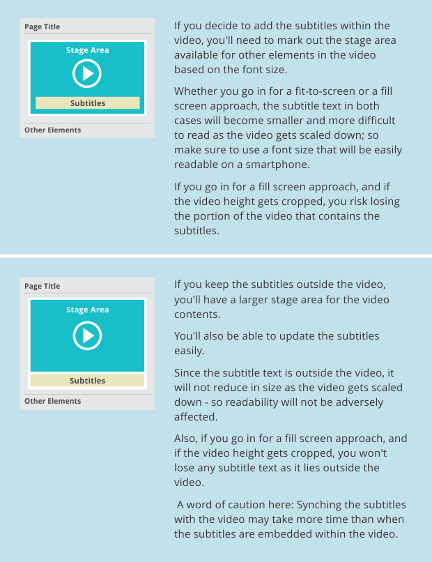
Another point to consider when working with responsive videos is the need for subtitles. This can be handled in two ways: the subtitles can either be a part of the video itself or they can be displayed outside the video, along with the other elements on screen.

Remember that, since videos automatically play full screen on iPhones (i.e. you can’t view any other screen content), you will have to include subtitles within the video. The video will be proportionately scaled (based on aspect ratio) to match the device height or width, resulting in smaller text.
When adding subtitles or any other text in a video, you need to make sure that the font type is easy to read on smaller devices. For example, a hand-written font may be more difficult to read, especially if the text is animated. In our experience, sans-serif fonts like Arial Bold appear well on smaller screens. Serif fonts can be more difficult to read as they create a flicker effect due to interlacing.
When selecting the font color, you also need to keep in mind the background color(s) and manage the contrast well to ensure readability.
A quick way to make sure that you have chosen the right font would be to check it on your smallest target device.
Interactive Elements
When scaling a video, you also need to keep in mind any interactive elements that you may have overlaid on the video. Make sure they scale along with the video and maintain the same aspect ratio and positions.
Optimization
When working with videos, keeping file size as low as possible is particularly important. We have found the following settings to be effective for video optimization. Please note that these may have to be changed based on your requirements:
- .mp4 format
- Full HD 1080p (1920 x 1080 pixels)
- Video bit rate of 8 Mbps
- Video codec H.264
- Audio codec ACC-LC (96 kHz or 48 kHz stereo
- Frame rate (24, 25 or 30fps, please avoid higher frame rates)
Responsive Video?
It may well be that every video isn’t suitable for viewing on all devices. Videos with elaborate infographics, for example, where the relationship between elements is very much dependent on placement, and that contain both text and graphics, may not be best suited for smaller devices. The same goes for animations with a lot of text/text labels/complex graphic organizers, and for live action films where details of an equipment or procedure are shown, without zooming in.
We hope this has been helpful. Do share your views in the comment box below.


