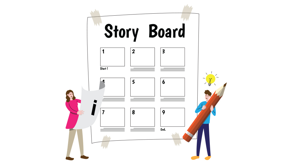
When I first started off as an ID, I was asked what my understanding was of ‘a storyboard’. I might have said something like, “it’s a skeletal representation of the flow of a course” or something similar. Today, after more than eight years of working on and with storyboards, I might use the following words to describe a storyboard:
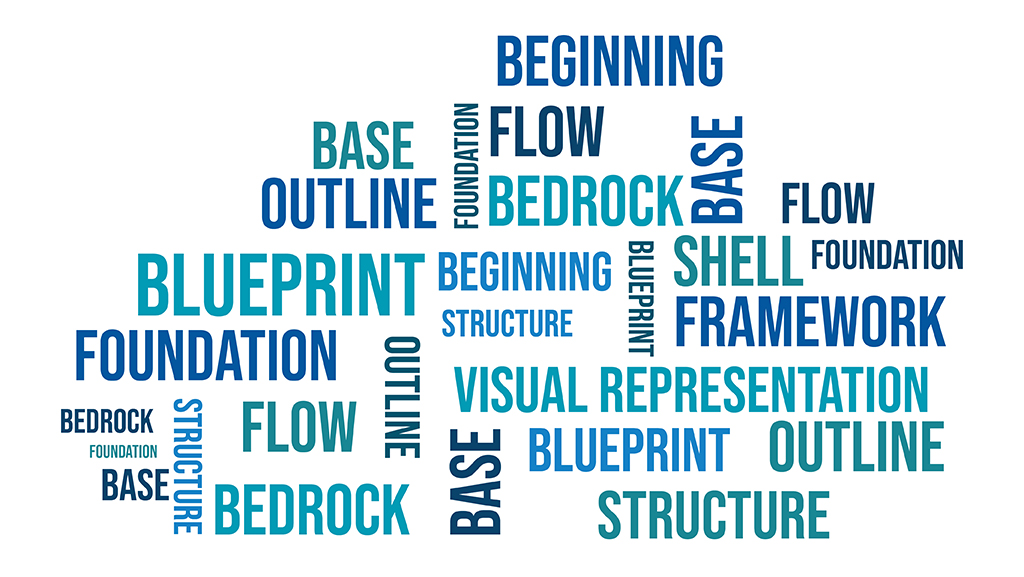
Each of these words triggers a thought about the top three aspects of storyboarding, in my opinion. But first, it’s important to keep in mind the people we are storyboarding for.
The Learner Perspective
Always the number one priority, the learner perspective is what needs to drive the storyboarding process. What learners need to be shown, told, what they need to experience—all of this is represented in the storyboard. How can we as the learning designers represent the learning experience as a visual progression of events is what storyboarding is really about.
The Reviewer Perspective
A storyboard depicts a learning designer’s vision of how a learning experience should come together to meet the intended learning and performance goals. But it is also important that the storyboard be interpreted as intended by anyone reviewing it. An important consideration in this process is the reviewer perspective, because their inputs and critique are what help make the content complete.
The Production Perspective
We design for our learners, yet we articulate our thoughts as IDs for the production team. In this regard, the storyboard is a learning designer’s own representation of how the learning experience should be produced. But we need to be mindful of the fact that our end consumer is the learner, not the production team, not the reviewer, so we need to storyboard accordingly.
I believe the storyboarding sweet spot lies at the confluence of these three perspectives, guided primarily by the learner perspective. So with the learner perspective driving a learning designer’s creativity, here are my top three aspects of storyboarding.
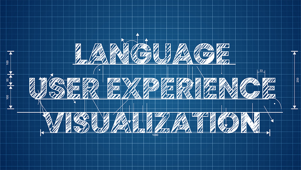
You gotta ‘LUV’ it!
Language
The key is to write, review and edit till you’re satisfied the writing conveys the key message without any extraneous information. If the writing isn’t easy to read, it won’t be easy to follow. So writing in a tone and style that suits the target audience and complements the nature of the content is an important consideration – both the script itself, as well as any on-screen text.
User Experience
Designing with empathy for the learner, bearing in mind the learners’ disposition, their constraints, the opportunities, their learning environment, their work environment—all of these contribute to how the experience ‘feels’ to the learners. It’s therefore a huge responsibility for the learning designer to figure out how on-screen elements should behave for an optimal learner experience, and overall how each screen should contribute to the learning experience through meaningful interaction opportunities for the learner. Here’s where user experience design aspects come into picture.
Visualization
Last, but certainly not the least, visualisation – how you envision the screen to come together, how all screens come together for a seamless learning experience. The on-screen elements, the media, the imagery, the text itself, and how these are all positioned on-screen—it all matters in the end, because it’s your vision as the learning designer, so visualise the entire experience in your mind first, screen for screen, minute to minute, and then put it down on digital paper.
What are your top three aspects for storyboarding? Would love to hear your thoughts. Drop a note at elearning@upsidelearning.com or post through comments below.


