(If you’re new to this series, here is some brief background to help you catch up:
Given the unique training challenges that the COVID-19 pandemic poses for us all, this series explores the various considerations for delivering an effective VILT (Virtual Instructor-Led Training). I recommend that you read the first two posts in sequence, and then, you can even pick and choose what’s of greater relevance to you.
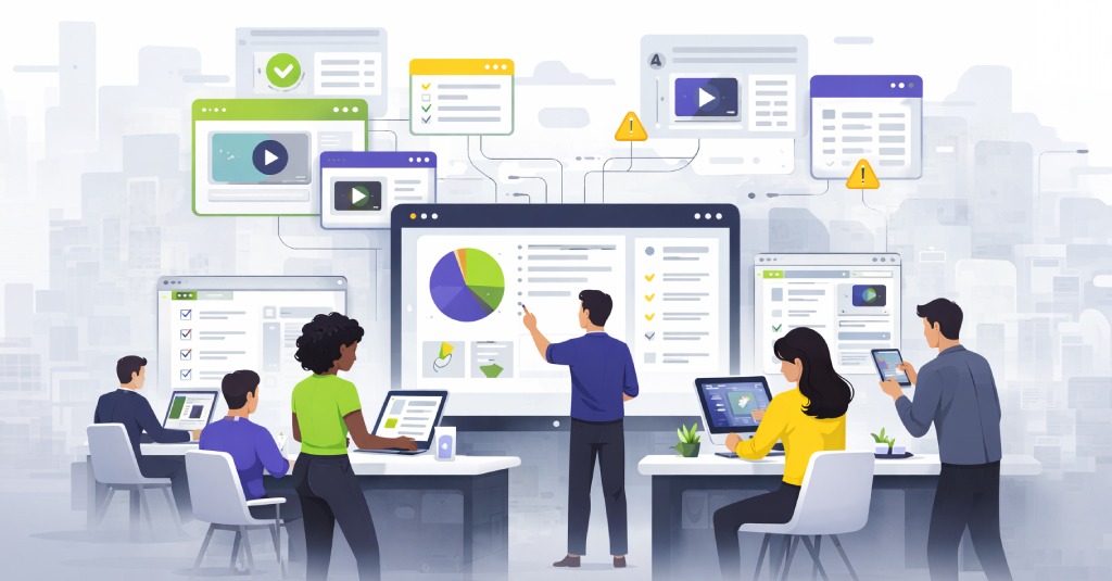
What means will you use to present your content? To someone organizing or commissioning the training, the question can seem like a no-brainer or non-issue – but for facilitators themselves this is a really big deal! It makes a huge difference how easy or how hard it is to control the means by which you present the information, how dynamic and customizable the method is, how much you can control the pace of information loading, and so on.
The display (whichever kind you use) is the central focus that kind of makes your session more engaging and becomes your learners’ visual guide through the content. Managing your display properly, whether you’re creating it synchronously or asynchronously, is one of the critical classroom management skills that any teacher or facilitator must master.
As it is so important, let’s consider three of the most commonly used tools:
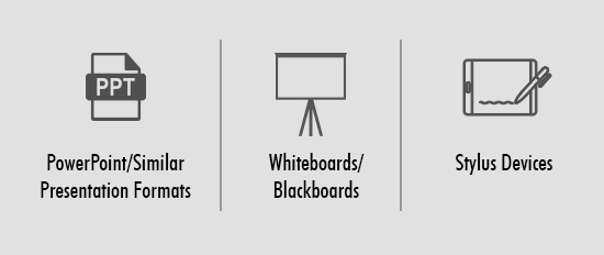

We have to start with this as it’s the most popular — good ole death-by-bullet-points! Actually, edgy criticisms of digital presentations have been around so long, they’re more clichéd than edgy – and the medium itself continues to thrive. You can make a presentation deck the site of a design murder or something very effective and elegant.
There is undoubtedly a lot that you can do with a presentation deck, and in many contexts, it is simply the most versatile, yet simple to use format. So yes, when it comes to digital presentations, we believe they’re not inherently doomed — just often poorly designed or misused.
The real drawback, though, is that your typical PowerPoint type program can’t hold non-linear or even linear multi-depth structure (think module-lesson-topic-page kind of structuring) too well. Oftentimes the curriculum structure is adjusted to adapt to the presentation tool than the content — and that’s obviously just wrong.
Then there is the real problem of perception: decks are widely associated with impending boredom. Starting off on a negative footing like this, it needs conscious effort to dissuade learners that this is not the case.
A good deck can significantly reduce the workload for the facilitator during the session – and mean a bigger workload for them before the session if they are the ones who have to create the deck! Frankly, even in a pre-corona world, our usual recommendation has been that it’s a good idea to outsource the design of the content to people like us and keep the delivery in-house.
When you’re considering a presentation deck for a VILT session particularly, consider the screen real estate you have: you have to look at your deck and your learners’ faces. The more learners there are, the harder it can be to keep track of both; and sometimes smaller device screens just make things doubly frustrating.
A final thought is about reference value. If you use a deck and make that available to learners after the session, that’s some solid reference value for learners (although sometimes, there is something to be said for not making things that easy…!)

Personally, I love old school whiteboards! I like being able to deliver a session where I have the flexibility of what I capture – how much detail, information shared by the audience and by me, supporting information for activities, and so on. Plus, it just helps subtly emphasize the importance of say, a term, or a concept when you actively put it on the whiteboard alongside your explanation. (The action cues learners to pay particular attention.)
This could be an excellent option if you can figure out camera and lighting. Let’s not forget that many of us are still working from home in ad hoc remote working setups. First of all, your facilitators are going to need to conveniently have a whiteboard lying around at home, markers that work (the real miracle!), good lighting, and enough clear space to have the camera at a proper distance to shoot the session. Plus, as your facilitators are just adapting to this kind of delivery and aren’t used to it, they are going to need to jump back and forth a bit to adjust the webcam focus and make sure learners can see the board (and the facilitator) clearly enough.
Additionally, in a VILT, you need to remember to not get caught up in the board and teaching, but to keep looking at your camera for eye contact with learners, and checking your laptop for what they’re sharing or asking.
There is probably higher engagement in the session (learners have to pay attention or you’ll wipe the board and move on and they lose out) but also absolutely no session reference for learners if they don’t make notes. The slow and distracted are left well behind and the ones who pay attention have a good experience.

In concept, this seems the best of both worlds, digital and old school analog.
If you’re not used to it, writing with the kind of tablet that designers use to draw can be next to impossible. It really takes a while to be able to control the stylus’ motion that smoothly. But with the variety of devices we now have – tablets and even laptops that support touch screens and screen writing, this is somewhat easier. You can install a doodle app and try out a digital pen. There is still definitely a learning curve, but if you persevere, you do have that ‘best of both worlds’ experience. The question is, do your facilitators have such hardware already, and do they have the time and feel the need to invest in acquiring the physical dexterity needed?
I keep saying this is the best of both worlds after that huge hurdle at the beginning, because while you make learners keep up and pay attention as with a whiteboard, you can save the whiteboard you create (take screenshots if the app doesn’t support saving) and share that later as a session reference aid.
It’s more dynamic than a presentation deck although it’s digital, and you can have collaborative building of content as with an old school whiteboard. You can also toggle the session nicely with e-interactivities and simulation nuggets and so on.
The common look out for all the methods (since we are talking of using them in a VILT) is with regard to connectivity variations: in poor bandwidth, it can get very frustrating for learners when the screen freezes; they see nothing and then you’ve leaped ahead to a whole new topic. Then it’s just levels of how disconnected they are in those lags between the different methods – there’s not a lot to choose from that way! At most, with a PowerPoint, you can share the deck with the learners to follow along, but you also run the risk of some folks kicking back, tuning out and deciding to skim the content later because they have the session material in hand.
I hope I’ve as usual given you a fair picture with the pros, cons, and considerations to weigh before you make your decisions. And remember, you don’t have to work through this maze alone: talk to us. We’re glad to help you navigate the many design choices that will affect your training’s effectiveness!
Looking to Go Virtual?
Talk to our Digital Learning Experts to understand how can we help you transform your ILTs to Digital Learning quickly and on a budget. Or write to us at elearning@upsidelearning.com


