At the very beginning I have to say that this is not a new deduction. Google already talked about context vs. content way back in 2012 by suggesting that ‘device choice depends on context’, and we added a thought or two about it in an earlier post about how not considering the context is one of the 5 mobile learning pitfalls.
What rules-context or content?
We are talking about eLearning here, where content has and will always be of utmost importance. After all it is the foundation on which all learning is built, that too to meet the learning outcomes/goals. But, we are not just talking about the knowledge element here. Content here represents the eLearning design, GUI etc. To bring in a bit more clarity, here’s a situation for you.
Jack is a new employee at a large organisation that provides maintenance services. As a part of his job he has been assigned to fix a leaking faucet. Jack however has no prior experience in doing so and he now needs a quick fix guide. These are the options available:
-
- An eLearning course (probably a simulation) that contains an elaborate explanation as on what a faucet is, the types of faucets, how it works and how it can be fixed etc.(Desktop based).
- An interactive module on fixing a leaky faucet (tablet-based).
- A PDF version with images of types of facets and step by step process with images (accessible- on any device).
What do, you think he opts for?
In this situation, most probably, Jack quickly opens the PDF version on his mobile phone. Looks at the images, compares the type of faucets, finds the right match and follows the instructions step by step and fixes the faucet.
Why do you think he opted for the not so well designed PDF version instead of the tablet or the desktop version?
The simple answer – Accessibility trumps design when it comes to mobile.
In the above scenario, Jack needed an immediate solution, rather than a well designed elaborate content, moreover where would he find a desktop if he was at a customer’s place? At times, the context of work performance is critical to the learning design or the content.
Here’s another example.
Text4baby is a free service provided in partnership by the non-profit organisation, ZERO TO THREE, and Voxiva, Inc. This app caters to pregnant women or new moms. The design here is restricted to SMS based information on the developmental aspects, rather than the visual elements.
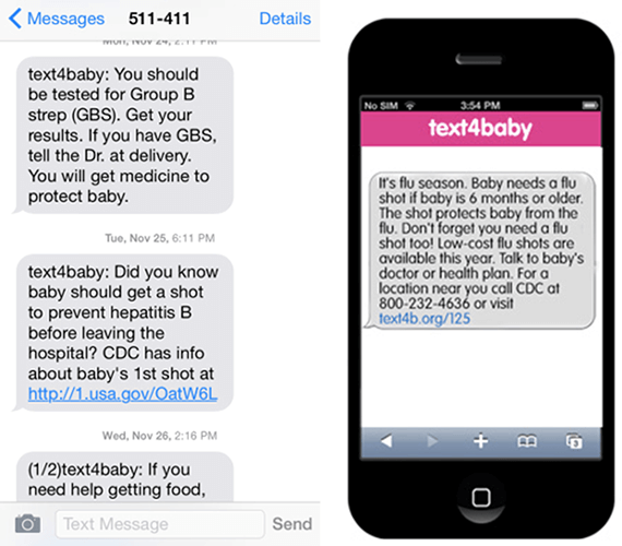
Here again accessibility is much more important than design.
To understand more about the importance of context in the multi-device world, join us for a Free Webinar – 3 Thing to Focus on for Creating Engaging Multi-device eLearning.


