More and more clients are coming up with a requirement to make their eLearning responsive to fit on multiple devices – some have a fixed set of target devices in mind, some want to increase flexibility and extend their eLearning to other devices, and some simply want to select this approach and technology from a future-proofing viewpoint even if it isn’t immediately applicable in their organization.
In previous blog posts, we’ve talked about what is responsive eLearning design and why it matters. Based on our experiences creating several responsive eLearning projects over the last 2 years, we had also listed the design challenges and considerations that can come up while creating responsive courses.
From a project management viewpoint, delivering the right quality within the estimated time frame and budget is obviously always the aim. With a responsive eLearning project, some additional considerations can arise with regard to best practices, process, framework, and even managing client expectations. Based on our experience in managing responsive eLearning projects (ReLP) so far, we’ve identified 5 key areas where a slightly different or additional focus may be needed to reduce risks associated with scoping, budgeting, and scheduling.
1. Decide on Content Treatment
When it comes to responsive eLearning, it is a common perception that content needs to be repurposed or shrunk to fit on small screens. However, from a learning viewpoint, this may not always be the best solution. Before you really decide on any specific content treatment or approach, it is important to understand the nature of the content and the overall learning outcomes, as well as the context in which learning material will be accessed.
Sometimes, it may not be possible to effectively display all content on a smaller screen by simply shrinking or resizing it. It is important to identify such content in the initial analysis and scoping stage, to work out alternative approaches.
Examples of such content might be:
- Application simulations [Guided and Practice Modes]
- Complex technical diagrams
- Animated stories/scenarios where you need to see details of the environment or objects or where there is important text within the animation
- Exploratory inter activities where you need to identify or locate areas to explore (visual hotspots)
2. Consider Offline Delivery
Considering that ReLPs are targeted for mobile devices, chances are some of your learners would want to access that elearning offline. You have two approaches here:
- Mobile/Offline Player – In this case, learners will initially need Internet access to download the Mobile Player app along with the course content onto their device. Once downloaded, they can view the content offline. They will again need Internet access for receiving any updates to existing courses or to download new courses, and also to exchange tracking data with the LMS/LRS.
- Course as an app – In this case, the learner will again need an Internet connection for downloading the course app for the first time and then for any updates to the same course thereafter. This approach will be useful only if you have a very few courses to deliver on mobile. Else, one would prefer a Mobile/Offline Player approach.
Here are some parameters, which we think are important to be considered while deciding the delivery medium for responsive eLearning courses:
3. List Target Devices
Before beginning a responsive eLearning project, it is important to get clarity on the targeted primary and secondary devices. This will help determine whether to go with a desktop first or a mobile first approach, and the design and development approach can then be aligned accordingly.
In fact, listing target devices will further help you with:
- Working out the specifications for your framework and templates
- Deciding the test strategy and accordingly determining a more accurate testing schedule and effort
- Procuring the required set of devices in advance (while simulators and emulators help to a certain extent, they may not necessarily give 100% accurate results)
4. Be Prepared for an Iterative Process
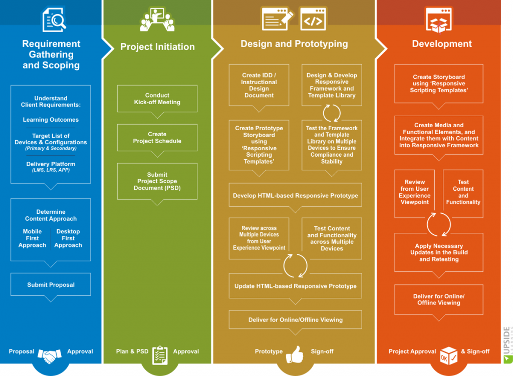
The responsive eLearning development process is dynamic and iterative in nature. You will need more consultation/discussion especially during the design and prototype phases. Hence it is important to budget efforts and also commit any timelines accordingly.
We’ve included an overview of the process that we’ve been using for ReLP so far. Stages where we found ourselves going through more iteration loops are marked with blue dotted lines.
5. Set Client Expectations
A responsive development approach will take longer and thus cost more upfront than what the client may be used to (as compared to traditional eLearning). Therefore it is very important to note that if managed properly, a responsive approach can save a lot of effort and cost on maintaining multiple versions across devices in the long run.
- It’s also important to specify the set of devices/OSs/browsers on which the eLearning will work and highlight the instances where alternative treatments or functionalities will need to be implemented, for example modifying functionality where a particular property or feature is not supported by a lower version of a browser
- Explain that while responsive eLearning design – and the associated technology – is still evolving, it can still provide a more future friendly approach as long as upcoming technology and browsers follow HTML 5 guidelines.
While responsive eLearning projects have certainly thrown up some new challenges for us, we have been successful in implementing and delivering the right solutions to our clients by using our in-house Framework for Responsive eLearning Development (FRED) and following some of the responsive eLearning project management practices mentioned above.


