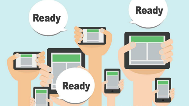
In a technology-driven world, today’s learners use multiple computing devices during the course of a day – primarily for work, some learning, a lot of entertainment, and for reference and support in their decision making. They are on the move and want to use their ‘downtime’ effectively by looking up information when and where it matters the most.
To meet this multi-device usage and expectation, we now have to design and deliver our materials across different devices, operating systems, browsers, screen sizes and resolutions. And not only does it need to work, it needs to display correctly to ensure an optimal user experience. This is complex, challenging and critically requires time and effort! So how do you meet this expectation? The answer is through responsive design.
Responsive e-learning Design is:
- Material and resources delivered from one source to multiple devices in a consistent manner
- Content responding to or moulding itself to devices’ dimensions
- Content changing its form or getting layered where required for a better user experience
Why is it important?
- An increasingly mobile workforce requires and demands flexibility and convenience
- Content must be available at the point-of-need and in context of usage
- Usage trends that span PCs to tablets and smartphones
- Adoption of BYOD, which has increased variety of mobile devices that require e-learning must support
A responsive framework lends itself to the design and development of a single design that is compatible across all possible user devices, enabling learners to access content from the device of their choice. In many cases, this covers the possibility of allowing learners to continue their learning experience while switching between devices based on their points of access and context of usage. The requirement for responsive e-learning development, however, is not really met by any of the popular authoring tools at the moment. Consequently, creating truly responsive e-learning is time consuming and expensive.
Framework for Responsive e-learning Development (FRED) enables faster and more reliable development of Responsive e-learning. It has been in the making for over 12 months and is a product of Upside Learning’s numerous HTML5 and Responsive e-learning programmes conducted over the last two years. The Framework shares our knowledge and experience with others to help meet e-learning challenges. As believers in the mantra ‘Keep Learning’, sharing our work ensures that we keep learning too! Here are some of the key challenges and resolutions of the responsive framework.

Browser-OS-Device Combinations
The first challenge was quite simply in the sheer number of operating systems and browsers; it was still important to try to narrow the range and specifically identify the primary devices and configurations to target.
Multiple devices mean various browsers. Each browser sends information called a ‘user-agent string’ – about itself and the device it is running on. We therefore needed to provide for every individual ‘user-agent string’ to ensure it displayed content accordingly. It didn’t end there! Browsers can interpret and render content in a slightly different manner, this required different coding for every browser to ensure their behaviour was correct and accurate.
The lower versions of Internet Explorer presented their own set of challenges. Last heard, Microsoft plans to phase out IE6 soon and usage of IE7and IE8 is also declining, leaving IE8 as one of the more prevalent browsers. But the problem here is that IE8 doesn’t support HTML5. So once detected, we needed to ensure that alternative treatments and solutions (or fallbacks) were defined. Using a mix of HTML4 and HTML5 to create FRED permitted us to create Responsive e-learning that is supported on lower browser versions too. We decided to put a system check into place that tells the user if their browser does or does not meet the minimum requirements. If it doesn’t, the e-learning simply won’t run and you end up with a sub-optimal learning experience.
We found that testing Responsive e-learning was a far more complex and intricate activity. This is because all the targeted combinations or devices need to be tested, which makes the whole process time-consuming and expensive! In fact we can go as far as saying that the testing stage can be the trickiest as attention to detail is absolutely pivotal in recognising even the most minute discrepancies or errors.
Usability
Two things that came up here are touch friendliness and navigation. Tablets and smartphones are touch devices, so we needed to ensure that interactive elements were both large enough and far enough apart to be comfortably selected. With touch devices, possibilities for gestural navigation also arose. So, in addition to providing buttons, we coded in support for a swipe gesture on tablets and smartphones.
We also needed to decide how to handle the global navigation as device size reduced. Since all navigation controls weren’t required for smaller devices, we chose to implement a responsive menu where controls get grouped and positioned based on device size. So controls are hidden or displayed based on device or OS – for example, most of us are used to using our tablet or phone’s audio controls, so audio controls were not included in the menu on mobile phones and tablets.
The other consideration was usability and the readability of text. Text size varies based on device resolution – the higher the resolution, the smaller the text. We found that a font size of 16 pixels seemed the best option across all devices and actually laid out the devices and checked.
Content Display
In Responsive e-learning, the treatment of content is transformed based on the device size and browser. So an Instructional Designer needs to think how to best alter treatments while ensuring that meaning and relationships between content elements don’t change across layouts, a consistent look and feel is retained and a user-friendly experience is guaranteed. In other words, we need to structure and visualize content accordingly. When rearranging content, we needed to be quite careful when handling images. There were a couple of options we came across here:
-
- The first option was to scale down the image and possibly not to display it below a particular size
- The second option was to reduce the image by cropping
- And of course the third option is a combination of the two – so we cropped and scaled dynamically!
While transforming content treatment for smaller devices, what we had to keep in mind was the layering of interactivities for smaller devices.
While transforming content treatment for smaller devices, we had to keep in mind the layering of interactivities for smaller devices. We limited the layers of interactivity to one or two on the larger devices to ensure that navigation did not get too complex on the smaller displays. This meant that while the first level of chunking was done for desktops, there was an additional level of chunking required for smaller versions.
Chunking and the organisation of content could be looked at in two different ways, depending on how comfortable the target group of learners is with scrolling content. If the e-learning is being created for just tablets and smartphones, then you could have bigger chunks of content that scroll on devices. Since we knew one of our primary devices was desktop, we went in for a desktop first approach and tried to avoid scrolling content.
The other thing to be wary of is that not everything is suited to a small device – application simulations, large complex technical diagrams, animated stories or scenarios. That type of content can be difficult to present effectively on a small device. As a part of the content analysis and design, it’s important to be able to identify such content and think of alternative approaches. And/or to even question whether the content should be included in the mobile version!
These were just some of the challenges and considerations we thought worthwhile listing. Responsive design can be complex and somewhat daunting but we hope you find these pointers useful and informative. We anticipate that growth of the adoption and usage of tablets and mobile learning in the coming year will be huge; and therefore the considerations for the demand and use of responsive e-learning will grow exponentially.
We hope this has made it easier for you to consider where and when to use ‘responsive’ design to make your eLearning user and device friendly in the multi device world we live in!
This article was originally published in Inside Learning Technologies & Skills May 2014 Issue


