A few years back, designers had a fixed size canvas, no matter what the medium – whether for print or digital media. Then came the multi-device revolution, and suddenly, there is no longer any fixed size. There are PCs and Macs, laptops, tablets, hybrids, phablets, and mobile phones out there, all with different dimensions and resolutions.
Therefore, as eLearning designers, how do we ensure that we create visuals that communicate effectively on all display sizes? How do we design to deliver user-friendly learning experiences on multiple devices? The answer is responsive design – unless you want to develop a different version for every target device and browser combination. However, responsive design is not straightforward and can pose challenges to beginners in this field.
Based on our experiences creating several responsive eLearning projects over the last 2 years, I have listed some key design challenges and considerations that can come up related to layouts; font selection; images, graphics, and animations; and interactive and navigation elements.
1. Designing Layouts Based on Breakpoints
When designing for responsive eLearning, the most important thing to keep in mind is flexibility, so that content can be restructured and readjusted to fit different screen sizes and resolutions.
To achieve this, we suggest that you think of the design based on the breakpoints you’ve decided. We found that designing for two breakpoints worked well. This gave us 3 standard layouts: a desktop, a portrait iPad tablet, and a portrait smartphone, allowing us to cover the largest, medium, and smallest screen sizes.
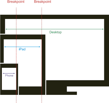
The breakpoints are the size at which the rules change, and the elements in the standard layouts are dynamically resized and readjusted to fit screen sizes that fall between breakpoints.
During the development process, we found it useful to create doodles for different layouts/sizes, and discuss them with other team members to ensure that the meaning of the information is retained and functionality is viable. This resulted in a more iterative approach, with greater cross-domain interdependence. As we gained experience, the interdependence tended to reduce, except when it came to a new template or a variation on an existing template.
2. Selecting the Right Font
So once page design templates are ready, we need to pick the right font to ensure good readability for the entire range of target devices. There are several considerations here.
Size
The same size font can look smaller or larger on different devices, depending on the device dimensions and resolution. For example, the same font size looks smaller on a high-density device like an iPhone 5 than on a comparatively lower-density device like a desktop PC.
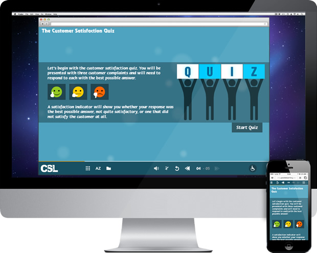
A solution here can be to use a relative sizing unit like “em” to dynamically set font size and line spacing for optimal readability across devices.
The “em” takes its size relative to its parent unit. So assuming the browser to be the overall parent, we can set 1 em to be equal to the browser’s default font size – which in most cases is 16 px. From there on, depending on how you structure your page, you can set relative font sizes in “ems” for texts in different containers.
If you want know more about the “em” unit, read Ethan Marcotte’s article on Fluid Grids, where he explains the logic behind this unit.
Type
Another point to consider is font type. Serif fonts are more difficult to read on digital devices, so it is recommended to select a sans serif font. Jessica Hische recommends the Il1 test to check readability of sans serif fonts: see how well an uppercase “I”, a lowercase “l”, and a “1” are differentiable.
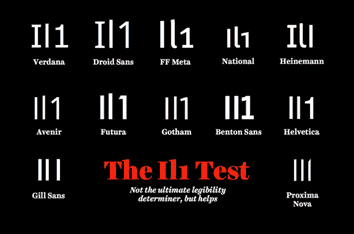
When using sans serif fonts, we also recommend avoiding italicized text, as it can be more difficult to read as it tends to get pixelated. This can be especially difficult for dyslexic users.
Also, unless you’re planning to embed the font, it may be better to select a Web-safe font.
Here are some Google Font Combinations; we recently tried one of them, and found that the text was easily readable on all the target devices. [Notice they’re all Web safe and sans serif fonts!]
3. Handling Images/Graphics and Animations
These are two critical areas that eLearning designers work with. Most of our courses include either raster (bitmap) images or vector graphics, and animations of varying complexities.
Here are some recommendations for handling these different visual elements in responsive eLearning projects:
Resizing JPGs and PNGs
These are raster (bitmap) image formats. They could be either photos or vector graphics exported as JPGs or PNGs. There are a couple of options to resize JPGs and PNGs to fit different display sizes.
1. Scaling – This means resizing based on screen size. Given that we’re talking about raster images, scaling smaller images up may lead to quality loss. It is therefore recommended to use bigger images, and dynamically scale them down based on device size.
2. Cropping – At times, when images are scaled to a very small size, you can no longer see the details, and their meaning gets lost. An effective alternative in such cases is to crop the image around a focus area that holds the meaning. This means using a larger image, and then reducing its size by cutting non-essential areas.
3. Combination – A third option is to combine both the above approaches to dynamically crop and then scale images depending on device size.

Images can be dynamically scaled and/or cropped using CSS.
SVGs and SVG Animations
Converting vectors to images can cause quality loss when you scale them up. A better solution is to convert vectors to Scalable Vector Graphics (SVG) format. The SVG format offers the following benefits:
- It bypasses the problem of screen resolution.
- It is built with XML, and therefore gives a relatively lightweight file.
- It can be manipulated and styled just like any other element on a Web page.
SVGs can be static, animated (for short, simple animations), or interactive. You can even create small animations in Flash and convert them into SVGs with the help of Swiffy.
A caveat here – some older browsers, such as Internet Explorer 8 and earlier, do not support the SVG format. So make sure to check browser support in targeted browsers before using this. You can look up details of SVG and browser support on caniuse.com.
If you happen to be targeting desktops/laptops with IE8/IE7/IE6, then another option for short, looped animations could be non-transparent GIFs (photos) or animated GIFs (vector animations saved as GIFs). These don’t do very well with scaling though, so we recommend creating the same animations as SVGs as well, for alternative use on supported browsers.
Icon Fonts
Another option to explore for static vector graphics is icon fonts. These are font families that contain a set of predesigned icons. Icon fonts behave just like any other font – you can change their color and size, give them a hover effect, give them varying levels of transparency or a shadow effect, and make them interactive.
In comparison to SVGs, icon fonts have a much smaller file size and are supported on lower versions of browsers (e.g. IE 8). However, icon fonts can only have single color – they cannot be given gradients; and if not Web safe, they need to be embedded into the eLearning package.
You can read more about icon fonts here.
Sprite Sheets
If your responsive eLearning contains a lot of small, short, looped, reused animations, you could consider using CSS sprite sheets.
A sprite sheet is a single PNG image that contains a sequential array of smaller, distinct images or graphics that make up an animation. These smaller images/graphics (frames) get displayed in quick succession, so it seems like an animation.
Sprite sheets offer several benefits:
- They tend to have a smaller file size (as opposed to if each image were saved as a separate file).
- They consume less memory and resources as compared to video animations.
- They load quickly as only one file needs to be picked up.
- The viewport can be easily adjusted to view one or more frames at a time.
Keep in mind, however, that sprite sheets can have certain dimension and file size limitations depending on the resolution and the RAM size of the device on which they are displayed. You can read more about sprite sheets here.
Here is an example of a sprite sheet for Angry Birds animations:
![]()
(Reference: http://chrome.angrybirds.com/)
Flash Animations Published as Videos
Creating long, complex animations with closely synched audio can be challenging and time consuming in HTML. For such cases, we recommend creating and synching the animations in Flash, and then publishing them in the required formats (MP4 and OGV) for integration within an HTML framework.
4. Handling Interactive and Navigation Elements
We interact with different devices in different ways. With desktops and laptops, there is an abstract layer of mouse and keypad, whereas with touch-based mobile devices, we can use our fingers in different ways to achieve different results.
Here are a few things to keep in mind to ensure a good experience on a variety of devices:
Ensure the interactive areas (buttons, hotspots, links, etc) are large and spaced out enough to be comfortably “touched”. As per Fitt’s Law, a larger, closer target is quicker and easier to select. However, if you do use smaller interactive elements, you could either increase their hit area beyond their visible borders – which will involve keeping distance between them, or match the hit area to the visible borders, with sufficient distance between the elements.
Apple recommends that touch targets should be at least 44 x 44 px; both Android and Microsoft recommend a touch target size of 9 mm (around 34-36 px).
You can show more global navigation controls upfront on bigger devices; but for smaller devices, it may be a better idea to group and layer them based on frequency of use.
Last but not least, any interactive element should look clickable or touchable. This is all the more important on touch-based devices – since these do not support hover effects, you need to design in such a way that users can easily recognize where interactivities are available.
To conclude:
Once you are done with designing and the designs have been integrated into HTML, take a quick look at them in the responsive view mode of a browser – for example, Mozilla Firefox and Google Chrome have this feature. You can get a rough idea of how the designs look on different device sizes (including intermediate sizes) from the point of view of visual consistency, look and feel, and layouts.
If you’d like to know how to use browser responsive modes, you can view the following videos: Firefox Responsive Mode and Chrome Responsive Mode.


