Ever since responsive eLearning became a buzzword we (at Upside Learning) have been inundated with requests from clients to make every (well almost every), piece of eLearning responsive and multi-device compatible. In my view, responsive eLearning design is just a technical solution to a specific requirement – simply put (as defined in Wikipedia) it is used to “provide an optimal viewing experience – easy reading and navigation with a minimum of resizing, panning, and scrolling – across a wide range of devices”. So it is not rocket science, it’s actually quite simple and it certainly isn’t a panacea or a ‘must have’ for every piece of eLearning that you create. For me, responsive eLearning should be proposed and implemented responsibly to ensure it delivers on its promise, and we have talked about this at Learning Technologies ’13, the HRD show and in our webinars and presentations (check out idea no. 8 in eLearning on iPads: 10 Bright Ideas).
The most important part of responsive eLearning design, in my opinion, is to ensure instructional integrity on all the devices. This is easier said than done and this cannot simply be done by shrinking the content or getting rid of heavier images of a desktop eLearning course to make it device responsive! Google’s multi-screen world report tells us that context drives device choice. And the factors that ‘context’ considers are: the time on hand, the goal we want to accomplish, our location, and our attitude, all at a specific moment in time.
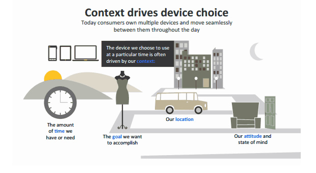 (Source: Google’s The New Multi-Screen World Study report)
Given that context plays an important role in the selection and use of a specific device, the goals we set out to achieve must also factor in the device that will be used. The instructional designer now has the responsibility to design eLearning based on the 3 elements of context>device>goals.
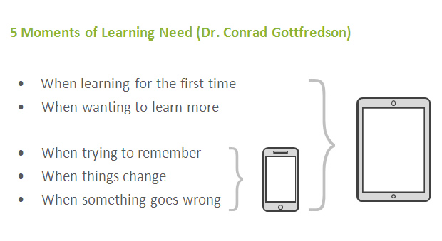
Now let’s look at Dr. Gottfredson’s 5 moments of learning need. If one has to choose between a smartphone and a tablet (for a ‘moment of learning need’), chances are that the smartphone will be picked for only the last three and in all probability for ‘remembering’ and/or when things have gone wrong!. So, more performance support or just in time learning need.
Now, if you are creating an eLearning course intended to meet the first moment of learning need, why would you consider making it available on smartphones? You could of course, create the eLearning to address ‘need 1’ and supplement it with a ‘responsive, multi device, performance support solution for ‘needs 3,4 & 5’ That’s being responsibly responsive!
Responsive eLearning development, being more complex, naturally involves higher costs and could take longer too, so it’s always wise to evaluate whether you really need responsive eLearning? It is quite possible you could be better off creating separate versions for PCs & tablets and one for mobiles.
At Upside Learning we have designed and built a framework which helps us deliver responsive eLearning but we don’t always use its responsive abilities – unless we (and our clients!) are convinced it is necessary. Horses for courses? Responsibly responsive?


