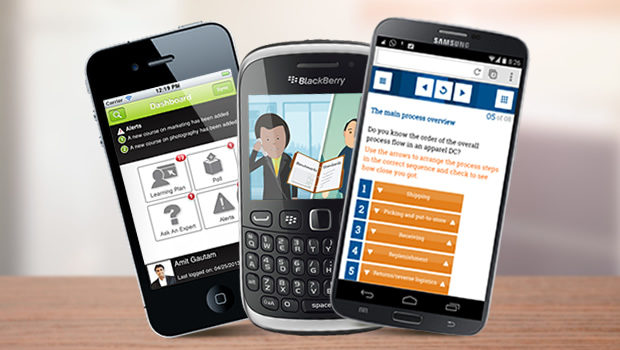
I recently came across a report on the Deloitte website, which estimates that global Smartphone market sales will touch 375 million by the end of 2011. This means that there are going to be millions of Smartphone users out there, who can access mobile learning anywhere, at any time. That’s a huge market whose needs we can hardly afford to ignore.
Mobile hardware has its own limitations and hence we need to adhere to some critical design conventions in order to make our mobile applications a success.
Limitations
- Usage Pattern: When people use an application on their Smartphone, it’s most likely that they have a particular task in mind. Chances are that they’re also on the move while accessing the application on their phone. They would want to complete the task as quickly as possible and don’t want to navigate through pages of content to get to it. Any mobile learning solution that we design needs to be easy to use even when our target audience is on the move. Interaction areas need to be easy to tap and important text should be large enough to read from a distance of 24 inches/ 2 feet.
- Slow Connections: Our mobile learning solutions should be able to work effectively on slow networks. That means that our designs need to be graphically light.
- Small Screen Size: Smaller screens mean less real estate available to work with. Our mobile learning solutions need to be designed in a way that’s optimized for a Smartphone screen resolution, and does not require the learners to zoom or scroll.
Five Mobile Learning Implementation Tips – Abhijit Kadle
- ✓ Keep it short and simple: This is significant in light of the nature of mobile devices and the situations in which they tend to be used. There can be frequent interruptions and learner attention to the device tends to be of a short span.
- ✓ Low information density: Don’t try to duplicate the length and information density of eLearning modules. The situations and devices with which the content is accessed warrants use of lower density information.
- ✓ Easy with multimedia: There is a cost associated with the development and access of such content.
- ✓ Include elements of collaboration: When used a part of a blended program, mobile devices can be used to facilitate interaction between peers, experts, mentors, etc.
- ✓ Provide tools and not just content: Mobiles’ ability to compute and display, combined with their personal and intimate nature, presents with lots of possibilities – geo location-based tools, networking tools, access to search and information databases, games, and simulations.
Additional Resources


