We often create scenario based courses for the engineering industry. Because they are for engineers; we consider the best way to represent graphics and animations is to use 3D isometric views with orthographic projections.
Trained engineers and technicians find it easy to read this type of graphic [if rendered properly] as it has clear projections on all three axes. All the lines in this type of drawings are parallel to their respective axis; so there is no distortion in the drawing no matter what the size of surface it’s drawn on.
According to Wikipedia –
Isometric projection is a form of graphical projection, more specifically, a form of axonometric projection. It is a method of visually representing three-dimensional objects in two dimensions, in which the three coordinate axes appear equally foreshortened and the angles between any two of them are 120 degrees.
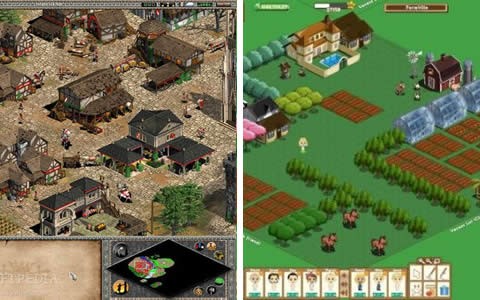
A lot of popular game graphics are developed using isometric views with orthographic projections. Age of Empires, SimCity, and Transport Tycoon, social games on Facebook like Farm Vile, Café World, all these games have 2D graphics but with are imparted with the feel of 3D using the same technique.
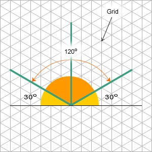
When it comes to creating these graphics; the best way is to use a grid like the one shown here. This grid helps to produce graphics with accurate dimensions, angles, and projections that you want to display. This grid basically has an angle of 120o as shown in the diagram.
We develop graphics in Adobe Flash using pretty much the same grid. As a graphic designer you have to be very careful when it comes to create complex graphic scenarios like as factory layout with open roof; where you need to display a lot of objects present within the premises. Every object has to be in proportion to each other. Based on the number of objects to be displayed you can make choices about the scale of the grid to use. At the same time you have to think about the light source. In our experience, it’s best not to keep the light source on the left or right as it becomes difficult to manage shadows on opposite sides; we prefer our light source on the top of the objects.
At times, isometric views can create illusions and then they become very difficult to read; take a look at the example below and you’ll see what we mean. Designers need to be careful about the placement of the objects in the scenario environment.
One cool thing about using isometric views with orthographic projections is that graphics or even animations created can be used another time by simply flipping them.


